Chart Report Sample Answer
Chart Report Title: The Percentage Of Housing Owned And Rented In The UK
Keywords or Topics: home
The samples about "The percentage of housing owned and rented in the UK" are handy resources for students to enrich their writing skills of chart report.
Besides, more chart report questions sharing the topic of "home" are added to help students understand the different requirements and target the assignments precisely.
Keywords or Topics: home
The samples about "The percentage of housing owned and rented in the UK" are handy resources for students to enrich their writing skills of chart report.
Besides, more chart report questions sharing the topic of "home" are added to help students understand the different requirements and target the assignments precisely.
| Actions & New chart report examples |
 The pie charts show the proportion of electricity produced by different energy sources in four countries in 2008. The table below shows the number of temporary migrant workers in four countries in 2003 and 2006. The flowchart shows the layout of a university campus before and after redevelopment. The table and line charts compare international tourist arrivals and revenue. The pie charts show the proportions of residential water usage. The bar charts show average rents for houses and apartments. The tables show international students in Canada and the US. The bar chart of the percentages of people in different age groups. The table and graph of Internet searches in US between 2004 and 2010. The bar chart shows the number of non-medical staff employed. The waste disposal in one European country over four years The changes in tourism in Australia The people in age groups who prefer genres of music The reasons people fly from the airport in the UK in 2016 The the process for recycling plastic bottles The information about the percentage of women aged 15-64 in employment The different methods of transportation used by UK university students The layouts of two kitchens for comparisons The trips made by different means of transport in the UK The people using public transport and private cars in Australia The population living in the two largest cities compared to others The number of hospital beds and patients waiting time The maps of a community center 10 years ago and today The changes in Australian Zoo between 1960 and now The changes in the proportion of the Australian workforce employed The present building of a college and the plan for changes
| Chart questions and samples |
Question:
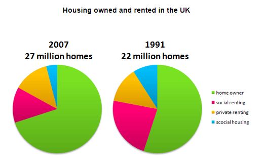
The pie charts below show the percentage of housing owned and rented in the UK in 1991 and 2007.
Summarize the information by describing the main features of the charts and making comparisons where appropriate.
Write at least 150 words.
Summarize the information by describing the main features of the charts and making comparisons where appropriate.
Write at least 150 words.
Answer 1
The pie charts compare homeownership and renting in 1991 and 2007, expressed as percentages. In 1991, homeownership was the most common form of housing, accounting for 60% of all homes...
Sixteen years later, in 2007, homeownership had risen to 70%, or almost three-quarters of all homes, an increase of 10% from 1991...
The percentage of privately rented homes remained unchanged at 11%. However, with 5 million more homes in 2007 than in 1991, the number of rented homes had increased despite the same percentage...
Sixteen years later, in 2007, homeownership had risen to 70%, or almost three-quarters of all homes, an increase of 10% from 1991...
The percentage of privately rented homes remained unchanged at 11%. However, with 5 million more homes in 2007 than in 1991, the number of rented homes had increased despite the same percentage...
Band: 8
Word Statistics
| Group | Word Number | Distinct | Percent |
|---|---|---|---|
| All Words | 153 | 81 | 52% |
| Top 300 Words | 65 (42%) | 24 (29%) | 36% |
| 300 - 1000 Words | 28 (18%) | 24 (29%) | 85% |
| Over 1000 Words | 60 (39%) | 33 (40%) | 55% |
Other Comments (larryausten)
Link Words: 7 (including link phrase: 0)
Sentences: Number: 9; Average Length: 100 characters; Words/Sentence: 17
Repeated Words: homes(8), rented(5), 1991(5), 2007(4), housing(4), social(4), homeownership(3)
Chart Report Questions for Topic : home
Samples