Chart Report Sample Answer
Chart Report Title: The People Using Public Transport And Private Cars In Australia
Keywords or Topics: transport
The samples about "The people using public transport and private cars in Australia" are handy resources for students to enrich their writing skills of chart report.
Besides, more chart report questions sharing the topic of "transport" are added to help students understand the different requirements and target the assignments precisely.
| Actions & New chart report examples |
| Chart questions and samples |
Question:
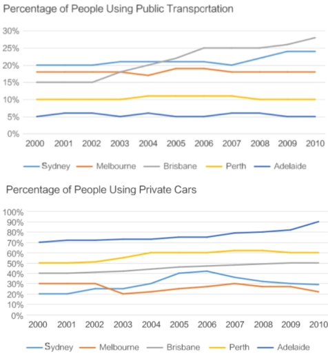
The charts below show the percentage of people using public transport and that of people using private cars in five Australian cities between 2000 and 2010.
Summarize the information by selecting and reporting the main features and make comparisons where relevant.
Write at least 150 words.
Summarize the information by selecting and reporting the main features and make comparisons where relevant.
Write at least 150 words.
Answer 1
The two-line charts compare the proportions of people who used public transportation or private vehicles in five Australian cities over a 10-year period, from 2000 to 2010...
Overall, the share using private cars was significantly higher than the share using public transportation in each city...
Looking first at public transportation, the line chart shows that Adelaide and Perth had the lowest proportions of users and remained stable over the decade (from 2000 to 2010), at around 5% and 10%, respectively...
Turning to private car users, Adelaide showed a slight climb, rising from 70% in 2000 to 90% in 2010...
Band: 7.5
Word Statistics
| Group | Word Number | Distinct | Percent |
|---|---|---|---|
| All Words | 189 | 100 | 52% |
| Top 300 Words | 82 (43%) | 29 (29%) | 35% |
| 300 - 1000 Words | 24 (12%) | 20 (20%) | 83% |
| Over 1000 Words | 83 (43%) | 51 (51%) | 61% |
Other Comments (mikehuck)
Link Words: 12 (including link phrase: 2)
Sentences: Number: 9; Average Length: 128 characters; Words/Sentence: 21
Repeated Words: public(4), transportation(4), 2010(4), and(4), private(3), from(3), 2000(3)
Chart Report Questions for Topic : transport
Samples
2. The different forms of transport in four countries
Samples
3. The rail transport in four countries
Samples
4. The ways of students in the UK to travel to school
Samples
5. The different modes of transportation to commute to work
Samples
6. The information on the delays and cancellations of a train company
Samples
7. The trips made by different means of transport in the UK
Samples
8. The different methods of transportation used by UK university students
Samples